Basics — what you always see
The pictures below zoom in on just the Indices & Sectors area (not the full website header or footer), so you can focus on what matters for trading.
On every tab you get: the four switches at the top (Indices Performance, Indices Heatmap, Sector Performance, Sector Heatmap), then the clock showing when numbers were last updated, a ? that opens this guide, and the Live refresh control. Each view also has its own link — for example you can save /market/indices-heatmap as a favourite.
- Clock — “how fresh is this screen right now?”
- ? — you’re here.
- Live — keeps updating during the session (timing depends on your plan, same idea as other live pages).
Indices Performance
Here you compare sector Nifty indices on the left with broader Nifty indices on the right. Each line is one index. Tap it to see which stocks sit inside that index in a pop-up.
Reading one row (today’s range & move)
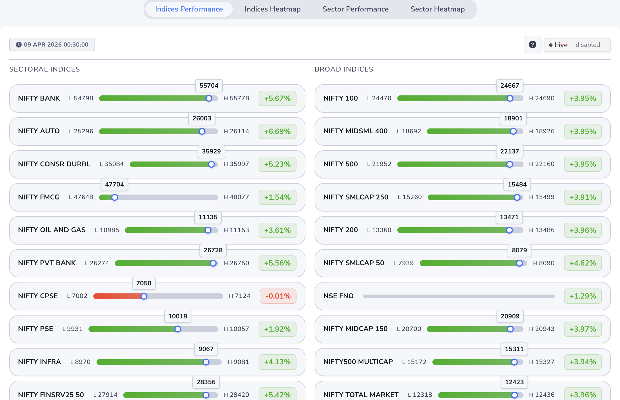
- Name — which index you’re looking at.
- L — today’s low so far.
- H — today’s high so far.
- Bar & blue dot — shows where the latest price sits between that low and high. The number in the small bubble is that latest price.
- Green / red % on the right — simple “up or down” for the day and by how much.
On some names the full high–low strip may not appear; you’ll still see the day’s % move.
Pop-up — “Stock” list
Open any index row to see its holdings. Each stock line works the same way as above: today’s low, high, latest price, and day’s %. If a stock has options, tapping the row can take you to its option chain in a new tab.
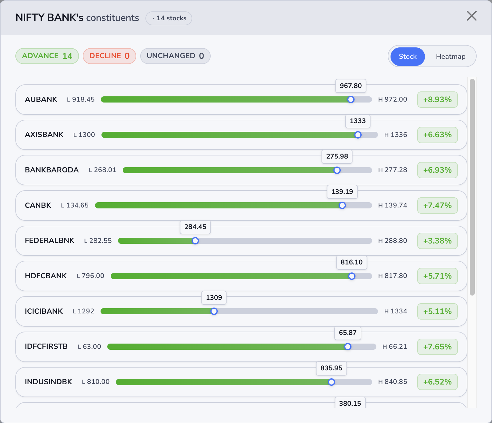
Across the top you’ll see three quick counts for that index today:
- Advance — how many names are green today.
- Decline — how many are red.
- Unchanged — how many are flat.
That gives you a feel for whether the index move is broad (many stocks participating) or driven by only a few names — open the list and see for yourself.
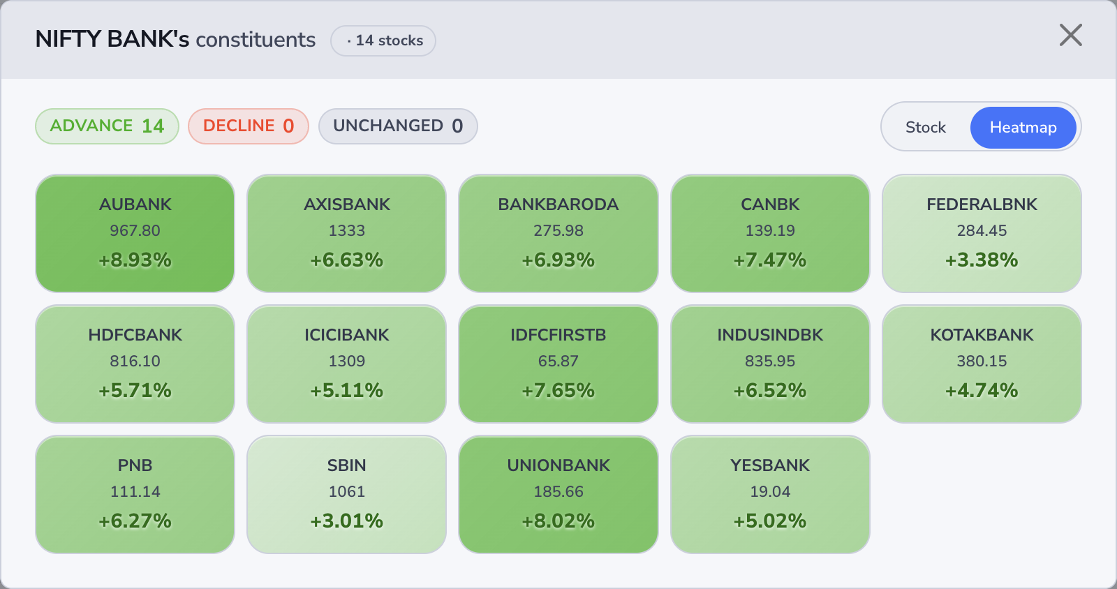
Pop-up — “Heatmap”
Flip to Heatmap for the same stocks as coloured tiles: quick sense of who’s strong or weak. Greener = better day, redder = weaker; stronger colour usually means a bigger move vs the others. Where we have high/low, you can hover a tile for those numbers.
Indices Heatmap
Same indices as the table view, but as colour blocks. Great when you want a ten-second snapshot of what’s hot and what’s not across the market.
The tile grid
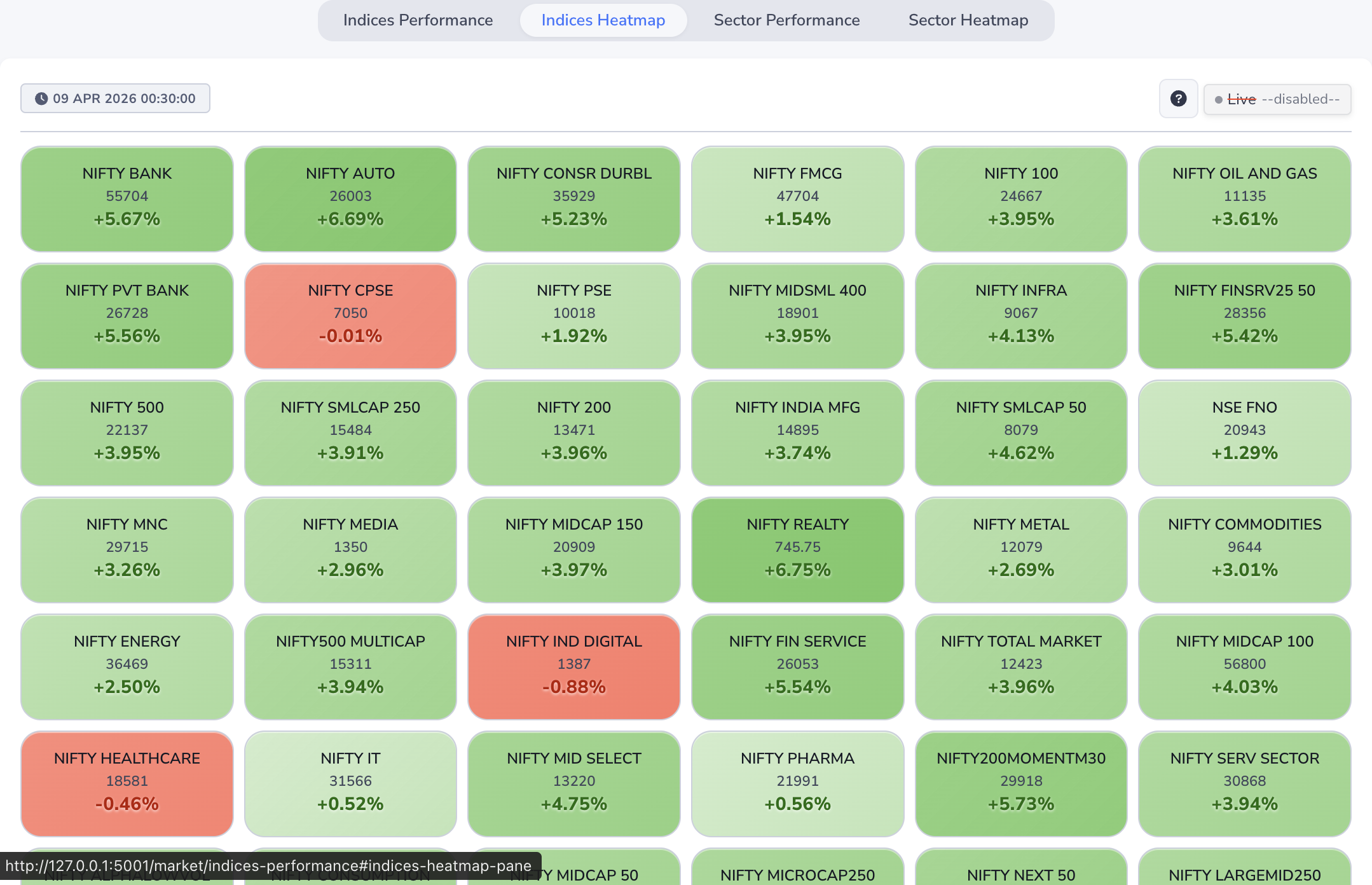
- Colour — green side = up day, red side = down day; stronger colour often means a bigger move compared to the other tiles on the screen.
- Top line — index name.
- Middle number — latest trading level when we have it.
- Bottom % — today’s up/down in percent.
- Hover — on some tiles you can hover to see today’s high and low.
Opening the stock list
Tap any tile — you get the same Stock / Heatmap pop-up described under Indices Performance (the walkthrough there uses NIFTY BANK as an example; every index tile works the same).
Sector Performance
This is your sector rotation view: NIFTY 500 names are grouped into sectors. Each row is one sector, and the % is the typical day’s move for stocks in that group. When you see “N stocks”, that’s how many names went into that picture.
Sector rows
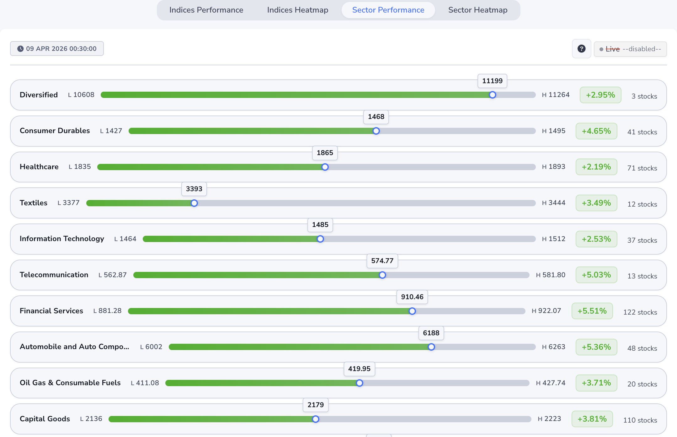
- Sector name — the theme (banks, IT, pharma, etc.).
- L / H bar — when shown, same idea as indices: today’s low, today’s high, and where the latest level sits on that range.
- % on the right — is this sector leading or lagging today on average?
- Stock count — how many companies sit in that bucket.
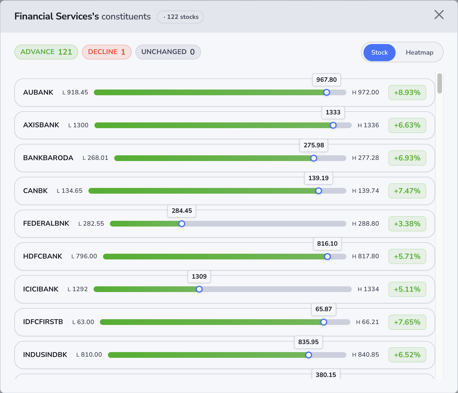
Pop-up — “Stock” list
Tap a sector to see the actual stocks. The header tells you the sector, and Advance / Decline / Unchanged tells you if the whole group is mostly winning, mostly losing, or mixed — before you scroll the names.
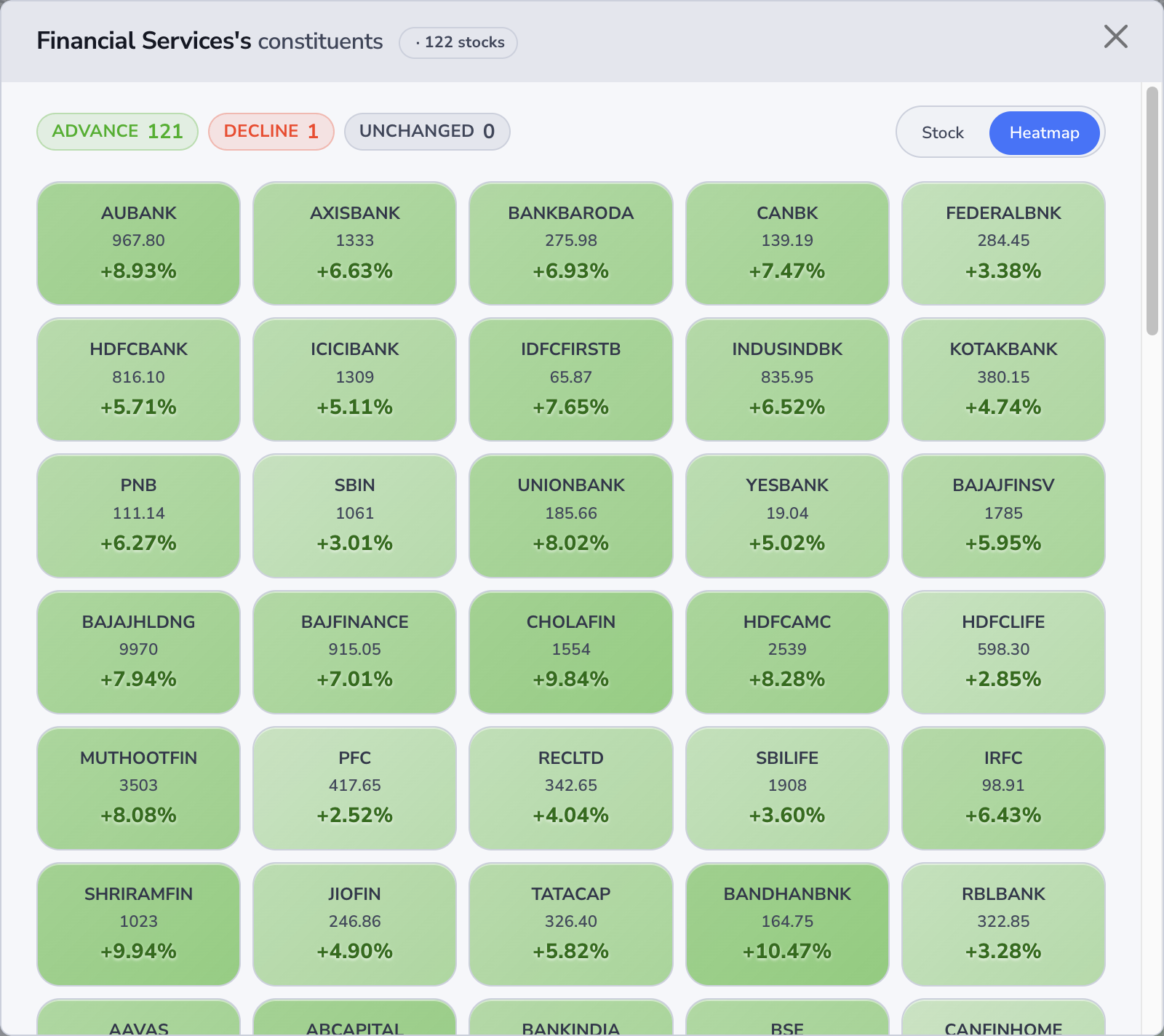
Pop-up — “Heatmap”
Same stocks, tile view — handy when the list is long and you only care about standouts.
Sector Heatmap
Like the index heatmap, but for sectors. One look: which parts of the economy are seeing the strongest or weakest average day.
Sector tiles
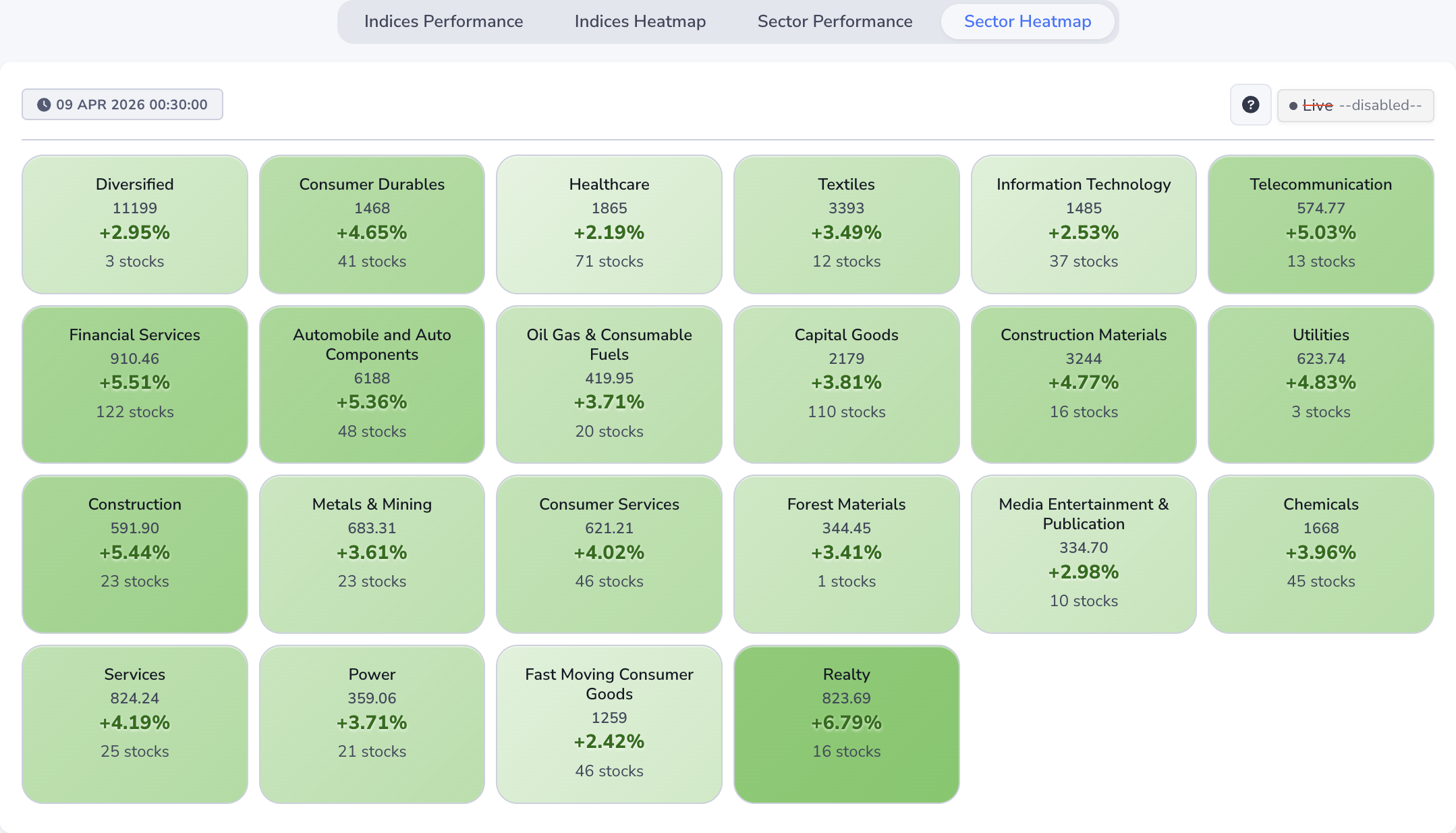
- Colour — green tones = sector average up, red = down; deeper colour usually means a bigger move vs other sectors on the page.
- Name — the sector.
- Middle number — a reference level for that row when available.
- % — the sector’s average day move.
- “N stocks” — size of the group behind that average.
Seeing the names inside
Tap a tile — you’ll get the same pop-up as on Sector Performance (Stock list or Heatmap). The screenshots above use Financial Services as an example; any sector tile behaves the same.