What is Put Call Ratio?
Put–Call Ratio (PCR) is a market‑sentiment indicator that compares how many put options are being traded (or are open) to how many call options are being traded (or are open) for the same index or stock. It tells you whether traders, as a group, are more focused on protection/downside (puts) or on upside (calls).
Screen overview
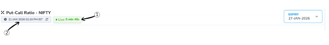
1Last Updated Time
This shows when the data was last refreshed so you know how current the information is.
2Live Status
The Live Status indicator confirms that the option chain data is updating in real time. The timer shown next to it indicates how many seconds ago the data was last refreshed.
Expiry
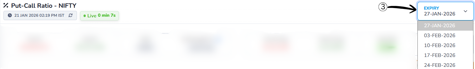
3Expiry Selection
Choose the expiry date for which you want to view the data. Options typically have multiple expiry dates, and selecting one updates the displayed data accordingly.
PCR Data Overview
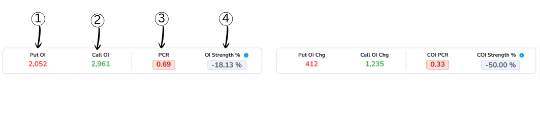
1Put OI (Put Open Interest)
Put OI shows the total number of active Put option contracts for the selected symbol.
2Call OI (Call Open Interest)
Call OI shows the total number of active Call option contracts for the selected symbol.
3PCR (Put-Call Ratio)
Put–Call Ratio (PCR) is a market‑sentiment indicator that compares how many put options are being traded (or are open) to how many call options are being traded (or are open) for the same index or stock. It tells you whether traders, as a group, are more focused on protection/downside (puts) or on upside (calls).
PCR Formula
PCR = Total Put Open Interest ÷ Total Call Open Interest
Example:
- Total Put Open Interest = 24,00,000
- Total Call Open Interest = 20,00,000
Calculation:
PCR = 24,00,000 ÷ 20,00,000 = 1.20
What PCR Values Mean?
PCR Interpretation
More puts than calls, potential support
Balanced market sentiment
More calls than puts, potential resistance
4OI Strength %
OI Strength % indicates which side is stronger — Put OI or Call OI — in percentage terms.
It compares the difference between Put OI and Call OI against their total absolute open interest.
OI Strength % Formula
OI Str% = ((PE_OI − CE_OI) / (|PE_OI| + |CE_OI|)) × 100
- > +60% → Put Dominance
- -60% to +60% → Neutral
- < -60% → Call Dominance
OI Change Analysis
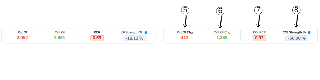
5Put OI Chg (Put Open Interest Change)
Put OI Chg shows how much the Put Open Interest has changed compared to the previous period.
6Call OI Chg (Call Open Interest Change)
Call OI Chg shows the change in Call Open Interest compared to the previous period.
7COI PCR (Change in OI Put–Call Ratio)
COI PCR compares the change in Put OI with the change in Call OI.
It shows which side is seeing stronger fresh activity during the current period.
- COI PCR > 1 → Put OI change is stronger
- COI PCR < 1 → Call OI change is stronger
Meaning:
A low COI PCR indicates stronger call-side activity, often hinting at bearish pressure.
8COI Strength %
COI Strength % measures the balance between Put and Call activity based on Open Interest changes.
It tells you whether traders are adding more Put positions or Call positions during the current period.
This helps identify which side (bulls or bears) is more active in building fresh positions.
COI Strength % Formula
COI Strength % = ((PE COI - CE COI) / (|PE COI| + |CE COI|)) × 100
- > +60% → Put Dominance
- -60% to +60% → Neutral
- < -60% → Call Dominance
Interval
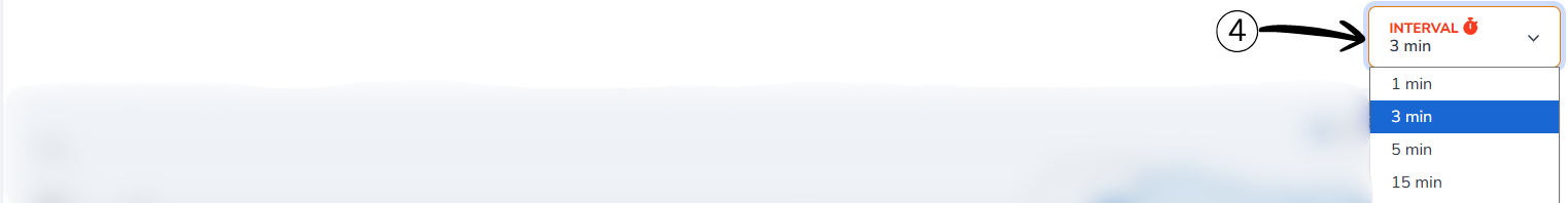
Interval determines how often the market data is refreshed on the chart. A shorter interval shows quick price and OI changes, while a longer interval smooths out market noise. Choosing the right interval helps you align the chart with your analysis timeframe.
Chart
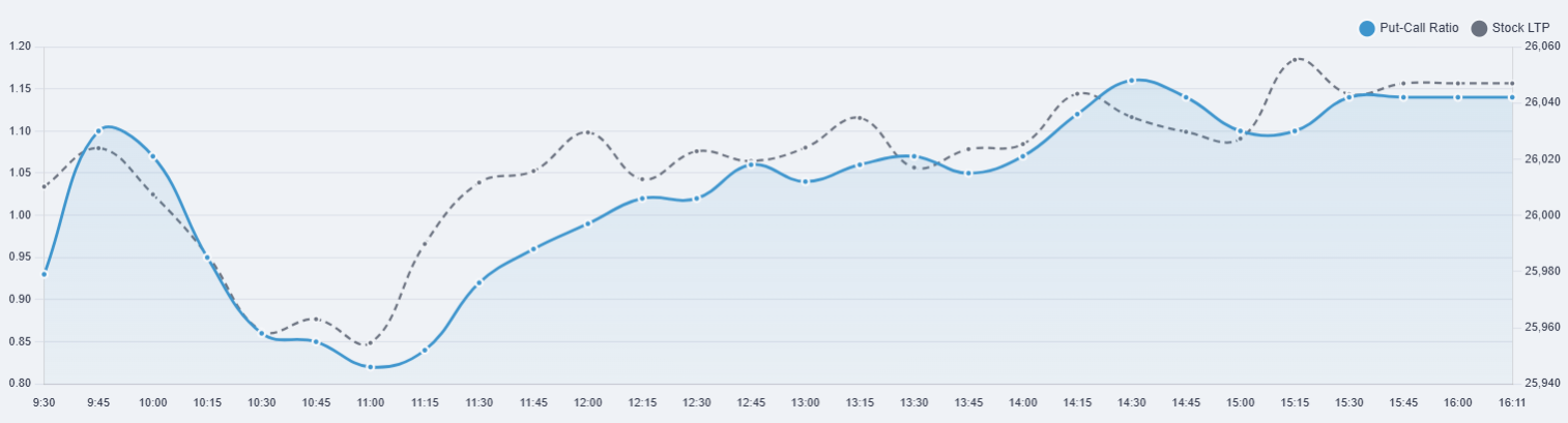
PCR (Put–Call Ratio) – Intraday Chart
This chart shows the intraday relationship between the Put–Call Ratio (PCR) and the stock's market price (LTP). It helps in understanding sentiment changes during the trading session.
1How to Read This Chart
The X-axis (horizontal axis) represents time, showing intraday intervals from market open to close.
The Left Y-axis represents the Put–Call Ratio (PCR), while the Right Y-axis represents the stock's price (LTP).
To read the chart, observe how PCR and price move together or diverge over time to identify changes in market sentiment.
2What Each Line Shows
Blue Line – Put–Call Ratio (PCR)
The blue line shows the Put–Call Ratio at each time interval.
- Rising PCR → Increasing put activity (defensive or bullish bias)
- Falling PCR → Increasing call activity (bearish bias)
Extreme PCR values may indicate overbought or oversold conditions.
Grey Dotted Line – Spot Price
The grey dotted line represents the actual market price of the stock or index.
- Shows real-time price movement
- Helps confirm whether PCR movement aligns with price action
How to Use This Chart
- If PCR rises while price is stable → Possible underlying support
- If PCR falls while price rises → Rally may be weak or unstable
- Best used with trend and volume confirmation
Note: PCR should be used as a sentiment indicator, not as a standalone buy or sell signal.
Index Table
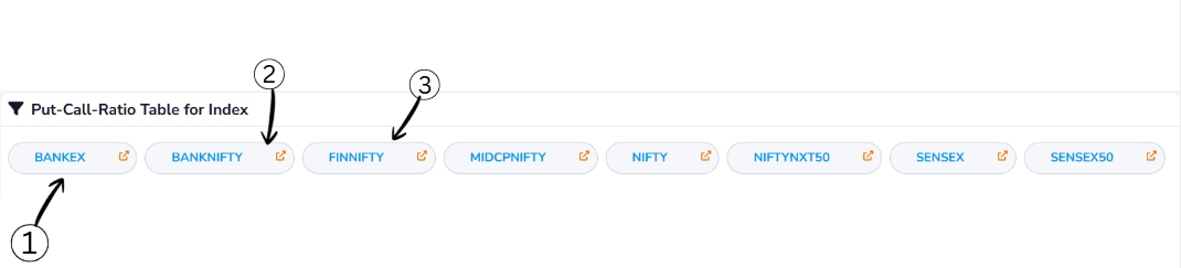
Symbol Selection
- Allows you to select an index symbol such as NIFTY, BANKNIFTY, or FINNIFTY
- Once selected, the system automatically navigates to the detailed view of that index and loads all related data
- Helps you quickly switch between symbols and focus your analysis on the selected market
View & Download
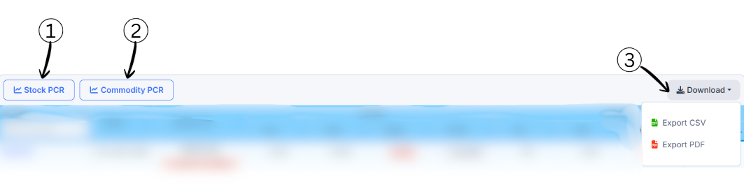
1Stock PCR
This option switches the view to Stock-based Put–Call Ratio. It shows PCR data calculated using options of individual stocks.
2Commodity PCR
This option switches the view to Commodity-based Put–Call Ratio. It displays PCR data derived from commodity options.
3Download
The Download option allows you to export the displayed data for offline use or further analysis.
- Export CSV → Download data in spreadsheet format
- Export PDF → Download data as a printable report
Put–Call Ratio Table – Column Guide
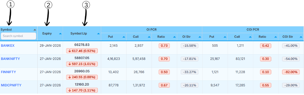
1Symbol
- This column shows the index symbol (such as BANKEX, BANKNIFTY, FINNIFTY)
- You can use the search box to quickly find a symbol. Clicking on a symbol opens its detailed PCR analysis
2Expiry
- This column displays the option expiry date for the selected index
- All Put–Call Ratio values in the row are calculated based on this specific expiry
3Spot Price
- Spot Price shows the current market price (Last Traded Price) of the index
- The arrow and percentage indicate how much the price has moved compared to the previous session
- 🔴 Down arrow → Price has fallen
- 🟢 Up arrow → Price has risen
Tip: Comparing Spot Price with PCR values helps in understanding whether market sentiment supports the current price move.
OI PCR (Open Interest Put–Call Ratio)
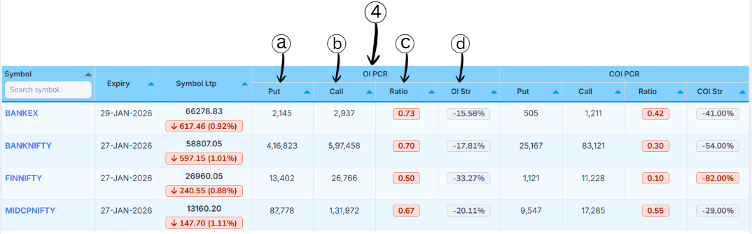
OI PCR helps you understand the balance between Put and Call positions based on total Open Interest.
aPut (Put OI)
- This column shows the total Put Open Interest for the selected symbol and expiry
- Higher values indicate stronger participation on the put side, often linked to support or hedging activity
bCall (Call OI)
- This column shows the total Call Open Interest for the selected symbol and expiry
- Higher Call OI usually indicates resistance levels or strong call writing activity
cRatio (OI PCR)
- This is the Put–Call Ratio calculated using total Open Interest
- It shows whether Put OI or Call OI is dominant
OI PCR Interpretation
- OI PCR > 1 → Put side stronger (bullish bias)
- OI PCR < 1 → Call side stronger (bearish bias)
dOI Str (OI Strength %)
- OI Strength % converts the Put vs Call OI difference into a percentage value
- It clearly shows which side is stronger and by how much
- Positive value → Put side dominant
- Negative value → Call side dominant
Tip: Use OI PCR and OI Strength together to identify strong support or resistance zones.
COI PCR (Change in Open Interest Put–Call Ratio)
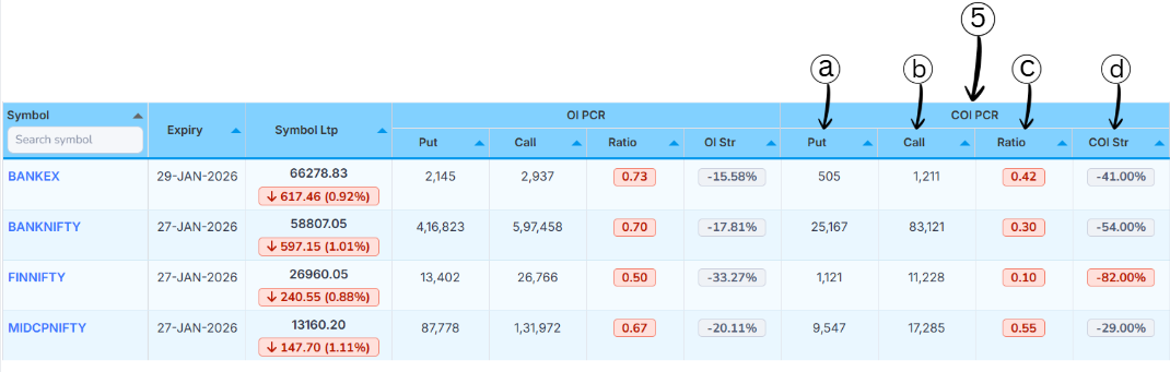
COI PCR focuses on fresh activity by comparing the change in Put OI and change in Call OI during the selected interval.
aPut (Put OI Change)
- This column shows the change in Put Open Interest for the selected symbol and expiry
- A positive value means new put positions were added; a negative value means put positions were unwound
bCall (Call OI Change)
- This column shows the change in Call Open Interest during the same period
- Higher values indicate stronger fresh call-side activity, often linked to resistance or call writing
cRatio (COI PCR)
- This is the Put–Call Ratio calculated using OI changes instead of total OI
- It highlights short-term sentiment rather than long-term positioning
COI PCR Interpretation
- COI PCR > 1 → Put-side change is stronger
- COI PCR < 1 → Call-side change is stronger
dCOI Str (COI Strength %)
- COI Strength % converts the difference between Put and Call OI changes into a percentage value
- Positive value → Put-side change dominant (bullish bias)
- Negative value → Call-side change dominant (bearish bias)