Screen overview
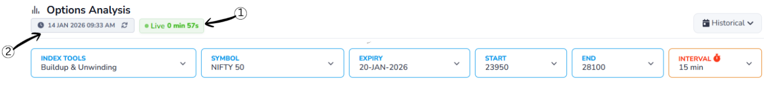
1Live Status Indicator
Shows that the displayed data is real-time market data and is being continuously refreshed. It also displays the time passed since the last data update, so you can see how fresh the information is.
2Last Updated Time
Shows the exact moment when the data was last refreshed. This timestamp helps users verify the recency of the information so you can base decisions on the most current market conditions.
Historical Data
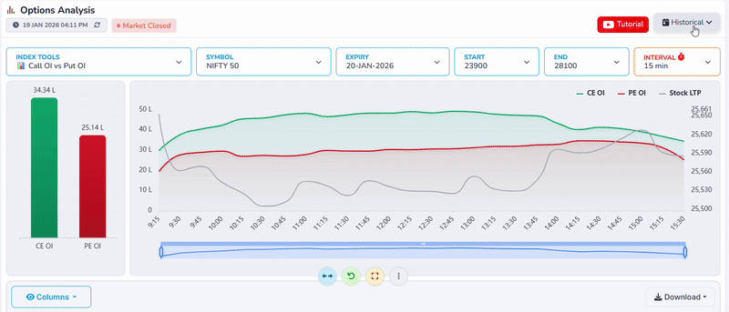
Choose a past date to view data for that trading day.
When a historical date is selected, the charts and values update to show how CE OI vs PE OI behaved during that day instead of live market data.
This helps you analyze past market behavior, compare different days, and see how price movement and open interest changed over time.
Header Controls
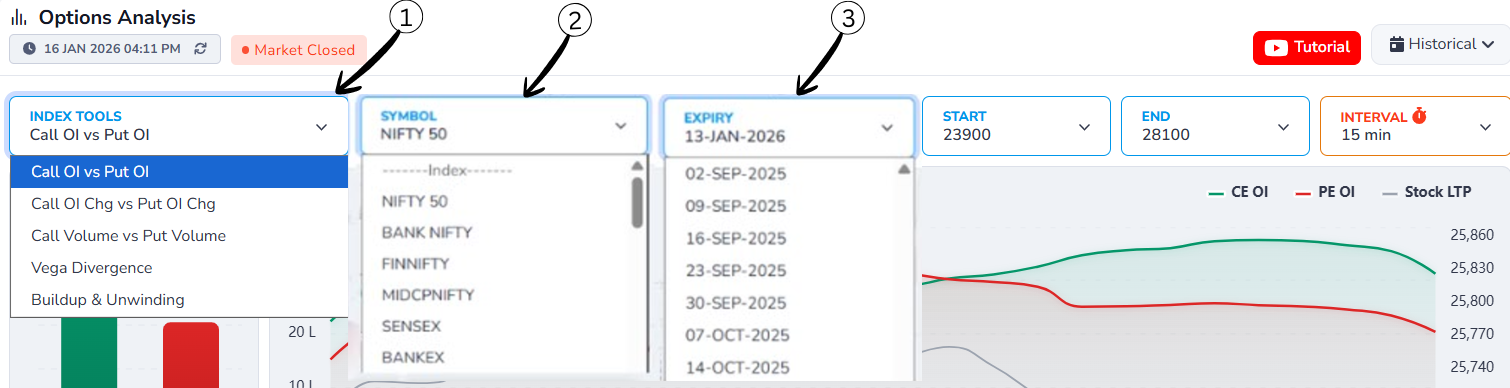
1Index Tools Dropdown
Allows users to select the type of analysis they want to view, such as Call OI vs Put OI, build-up and unwinding, or Volume-based analysis. Once selected, the charts and data update accordingly.
2Symbol Selection Dropdown
Lets users choose the market index or symbol (e.g., NIFTY 50, BANK NIFTY, FINNIFTY). Selecting a different symbol updates the data to show information specific to that index.
3Expiry Date Dropdown
Opens a list of available expiry dates. By selecting a different expiry date, users can view Call OI vs Put OI data for that specific expiry, making it useful for historical and comparative analysis.
Strike Price & Interval Controls
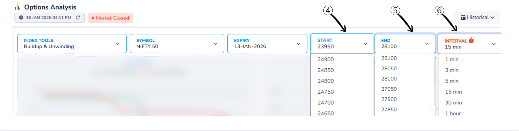
4Start Strike Price Dropdown
Allows users to select the starting strike price for the analysis range. The data and charts will begin calculating Call OI vs Put OI from this selected strike price.
5End Strike Price Dropdown
Used to select the ending strike price for the analysis. Together with the start strike, it defines the complete strike price range included in the analysis.
6Interval Selection Dropdown
Lets users choose the time interval (such as 1 min, 5 min, 15 min, or 30 min) for data calculation. A smaller interval shows more frequent changes, while a larger interval provides a smoother and broader market view.
Chart/Graph
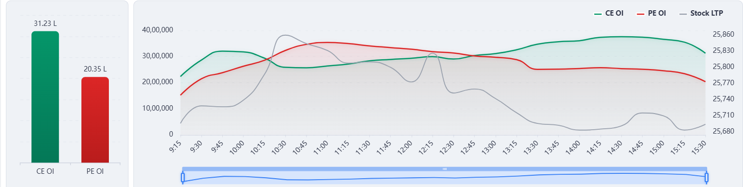
Breaking Down the Chart
The chart shows real-time dynamics between call and put option activity for Nifty 50, with data recorded every 15 minutes (9:15 AM to 3:30 PM market hours).
Chart Explanation
Green Line – CE OI (Call Open Interest Change)
- Represents the intraday change in Call Open Interest.
- Stays consistently above the red line for most of the session, indicating stronger call-side activity.
- A steady rise, especially after mid-day, shows continuous addition of Call positions, mainly by option writers.
Red Line – PE OI (Put Open Interest Change)
- Represents the intraday change in Put Open Interest.
- Although PE OI increased in the first half, it failed to keep pace with CE OI later in the session.
- The gradual decline toward the end suggests reduced put writing or partial unwinding.
Grey Line – Spot Price (NIFTY)
- Shows NIFTY's intraday price movement.
- Price peaked early, then moved downward and sideways, failing to sustain higher levels.
- This price behavior aligns with heavy call writing pressure.
Column/Download
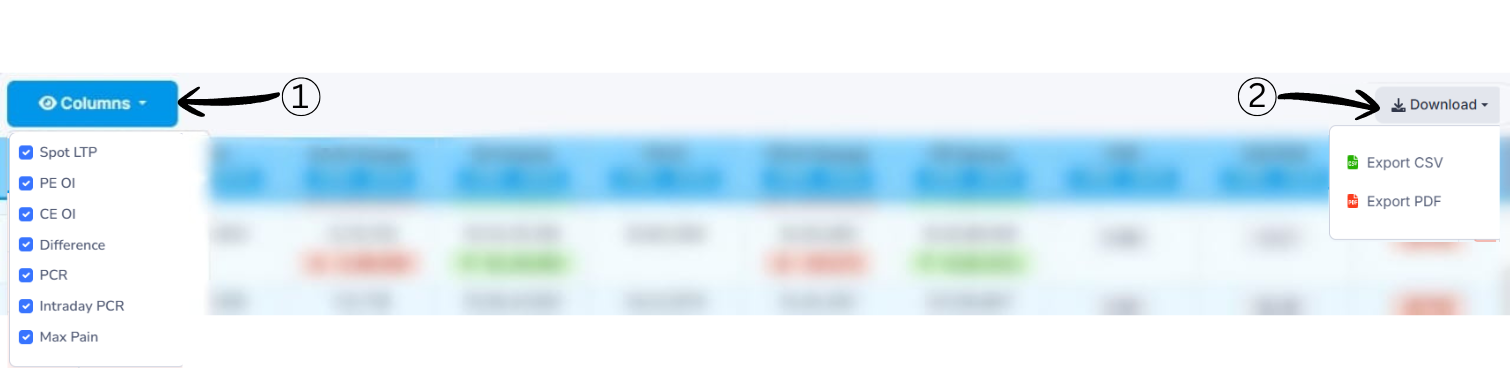
1Columns Selection
Allows users to enable or disable table columns based on their preference.
2Download Options
Lets users export the displayed data for offline use or record keeping.
Time & Price Data
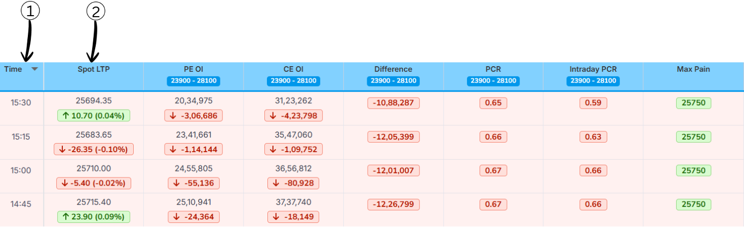
1Time
The timestamp when the data was recorded. Each row represents data at different intervals during the trading day (15:30, 15:15, 15:00, 14:45, etc.).
2Spot Price (Last Traded Price)
The actual price at which Nifty 50 was trading at that specific time. For example, at 15:30 (market close), Nifty was at 25,694.35. The colored arrow (↓ or ↑) shows if it moved up or down from the previous interval, with the percentage change in parentheses.
Open Interest Analysis
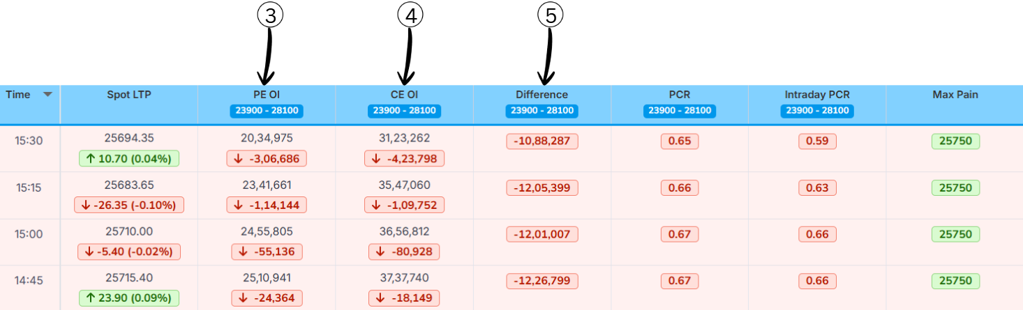
3PE OI (Put Option Open Interest)
The total number of put option contracts still open (not closed or exercised) at that time, expressed in the given strike range. For example, at 15:30, there were 20,34,975 put contracts outstanding. The red number with ↓ shows it decreased by -3,06,686 contracts since the last interval.
Why It Matters: Rising PE OI suggests traders are becoming more defensive. Falling PE OI suggests they're exiting bearish positions.
4CE OI (Call Option Open Interest)
The total number of call option contracts still open at that time. For example, at 15:30, there were 31,23,262 call contracts outstanding. The red number with ↓ shows it decreased by -4,23,798 contracts.
Why It Matters: Rising CE OI suggests bullish optimism. Falling CE OI suggests traders are trimming long bets.
5Difference (CE OI vs PE OI)
Shows the net gap between Put Option Open Interest (PE OI) and Call Option Open Interest (CE OI) for the selected strike range.
Formula
Difference = PE OI − CE OI
What it tells us
- Helps identify which side is stronger: Calls or Puts
- Acts as a quick strength indicator in the option chain
How to read the value
- Negative value (−) → CE OI is higher than PE OI → Call side dominance → Possible resistance or bearish bias
- Positive value (+) → PE OI is higher than CE OI → Put side dominance → Possible support or bullish bias
Example
PE OI = 20,34,975
CE OI = 31,23,262
Difference = 20,34,975 − 31,23,262
Difference = −10,88,287
Conclusion: A negative difference means the call side is stronger, indicating resistance in that zone.
PCR & Max Pain Analysis
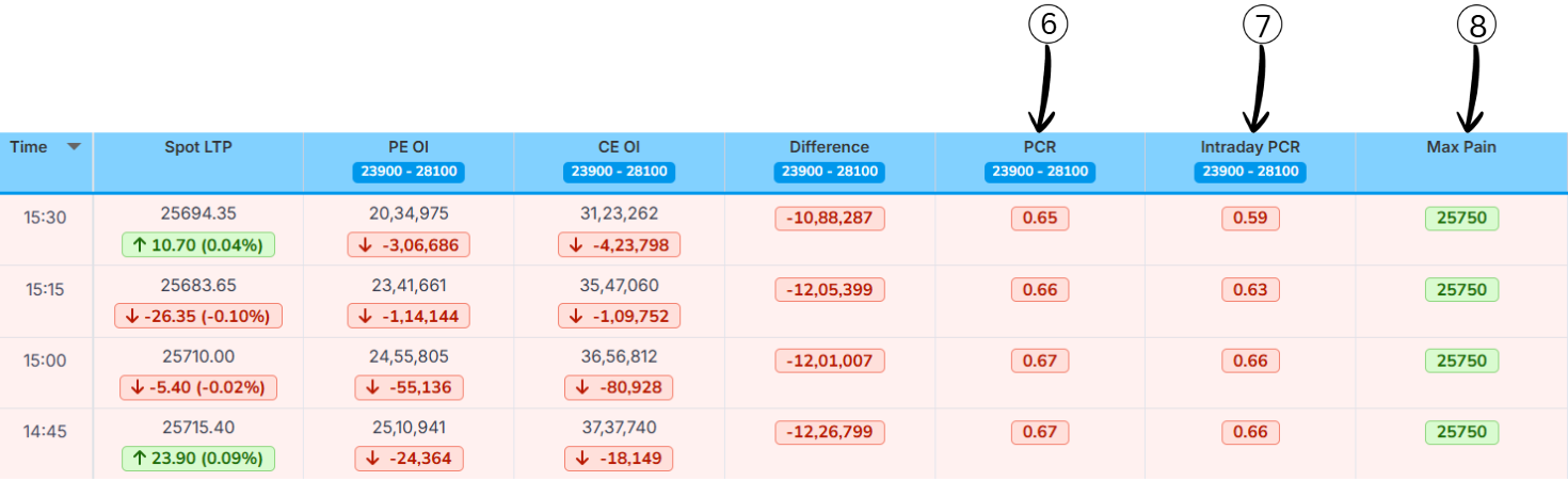
6PCR
Put–Call Ratio (PCR) is a market sentiment indicator that compares how many put options are being traded (or are open) to how many call options are being traded (or are open) for the same index or stock. It tells you whether traders, as a group, are more focused on protection/downside (puts) or on upside (calls).
PCR Formula
PCR = Total Put Open Interest ÷ Total Call Open Interest
Example:
- Total Put Open Interest = 24,00,000
- Total Call Open Interest = 20,00,000
Calculation: PCR = 24,00,000 ÷ 20,00,000 = 1.20
What PCR Values Mean?
| PCR Range | Market View |
|---|---|
| > 1.2 | Bullish |
| 0.8 – 1.2 | Neutral |
| < 0.8 | Bearish |
7Intraday PCR
Measures the ratio of today's put option activity to today's call option activity within the trading day. Usually calculated using today's traded volume (or today's change in OI) of puts divided by today's traded volume (or change in OI) of calls for that day. It tells you what traders are doing right now during the session, not what they have built over many days.
Formula and Difference from Normal PCR
Normal PCR uses total PE OI ÷ total CE OI for that expiry and range.
Intraday PCR uses today's fresh build-up or volume in PE ÷ today's fresh build-up or volume in CE for the same period.
So:
If Intraday PCR is very high, it means that today more puts are being added or traded than calls, showing strong fear/bearish hedging intraday (often a contrarian bullish hint if extreme).
If Intraday PCR is very low, it means today traders are aggressively taking call positions compared to puts, showing intraday bullishness that can become over-optimistic at extremes.
8Max Pain
The strike price at which option buyers (calls + puts together) would lose the most money at expiry, and option sellers would gain the most.
- If max pain is below the current LTP, it is shown in red (price trading above the max‑pain level).
- If max pain is above the current LTP, it is shown in green (price trading below the max‑pain level).